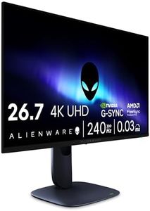
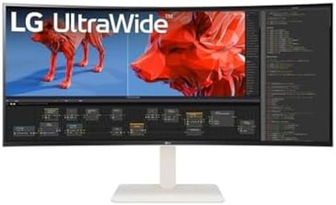
10 Best Monitor For Color Grading
From leading brands and best sellers available on the web.By clicking on a link to a third party's website, log data is shared with that third party.
Related Products

Buying Guide for the Best Monitor For Color Grading
Choosing a monitor for color grading is a critical decision for photographers, videographers, and digital artists since color accuracy and screen performance can dramatically influence your work. When shopping for such a device, it's important to focus on factors that directly affect how faithfully the monitor displays color and detail. Understanding what to look for allows you to match a monitor to your workflow and ensures your edits look great on any device.Panel TypeThe panel type refers to the technology behind the screen and is significant because it determines the monitor’s color accuracy, viewing angles, and overall visual quality. Common panel types include IPS (In-Plane Switching), VA (Vertical Alignment), and TN (Twisted Nematic). For color grading, IPS panels are usually recommended since they offer the most accurate colors and the widest viewing angles, meaning your edits remain consistent even when you're not looking directly at the screen. If you do a lot of professional color work, stick with IPS. VA panels have better contrast but can be less precise with color, and TN panels are best avoided for color work due to their limited color range and poor viewing angles.
Color Gamut CoverageColor gamut coverage refers to which color spaces the monitor can display and how much of each space it covers. The most common are sRGB, Adobe RGB, and DCI-P3. Monitors that cover 100% of the sRGB color space are decent for web work, while higher percentages of Adobe RGB or DCI-P3 are better for print and video since those spaces contain more colors. For most color grading tasks, look for monitors that cover at least 99% sRGB and, if possible, aim for at least 95–100% Adobe RGB or DCI-P3 if your work is destined for print or cinema. Pick the color space that matches the final use of your images or videos.
Color Accuracy (ΔE)Color accuracy, often measured in Delta E (ΔE), tells you how open to error the monitor is when displaying colors; the lower the number, the more accurate the monitor. Values under 2 are considered nearly indistinguishable from perfect to the human eye. If your editing demands absolute consistency (such as for professional print or broadcast), aim for a monitor with ΔE less than 2. For less critical work but still solid results, a ΔE under 3 is acceptable. Knowing how crucial accurate color is to your work will determine how much emphasis you put on this spec.
Calibration SupportCalibration support is about how easily you can fine-tune your monitor to maintain color accuracy over time, since even the best displays can drift in color performance. Look for a monitor that allows hardware calibration, meaning you can use devices like colorimeters to adjust the display itself rather than just tweaking your computer's color settings. If you do intensive color grading, built-in calibration tools or companion software can help keep your screen true to life. Frequent calibration will be more important for professionals and less so for occasional editors.
Resolution and Screen SizeResolution is how many pixels fit on the screen, and screen size impacts how large and clear your images appear. Higher resolutions like 4K (3840 x 2160) give you more real estate and finer detail, which is helpful for seeing subtle edits. A larger screen, such as 27” or more, lets you work more efficiently, but make sure the resolution matches the size so images remain sharp. For detailed editing, pairing a screen size of 24–32 inches with a resolution of at least 1440p (2560 x 1440) or 4K delivers the best balance of clarity and comfort.
Uniformity and Backlight QualityUniformity describes how evenly the monitor displays brightness and color across the whole screen. Poor uniformity can result in patches that are brighter or tinted, which can mislead your edits. Monitors designed for professional use sometimes offer uniformity compensation modes to reduce these differences. If your projects demand perfect consistency, especially for print or big screens, check that your chosen monitor scores well for brightness and color uniformity, often listed in reviews or technical sheets.
ConnectivityConnectivity refers to the input ports the monitor offers, such as HDMI, DisplayPort, USB-C, and sometimes Thunderbolt. The right ports ensure compatibility with your computer and enable features like daisy-chaining monitors or charging laptops. Look at the devices you’ll connect and make sure your chosen display has the necessary ports for a smooth, future-proof workflow.